
We continue to wait to hear about where the resurrection of our departed basketball team will come from. We sit and watch any news about teams in financial trouble. We analyze every word that Adam Silver says about expansion. We set up Twitter alerts from @sonicsarena and @ChrisDaniels5. And we wait.
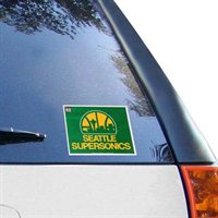
And while we don't know from where our team will come, one thing we do know is that the team will be called the Seattle SuperSonics, and one thing that we have to assume is that it will wear green and gold (Please, Mr. Hansen, do not make us suffer through another "pine and wine" debacle.). Beyond that, we really don't know anything about what the look and feel of the team will be. Which, naturally, means we get to speculate wildly!
Looking at the renderings and formal plans from Sonics Arena, there is an abundance of imagery representing the team's identity from 2001-2008. We see this era's primary logo show up at center court.

We also see the secondary logo on the floor of the team's locker room.

There are images of Kevin Durant wearing the team's jerseys from that time period on the big screen (but then again, that was the only Sonics jersey Durant ever wore).

For another era in the team's history, there are renderings showing Gary Payton on the big screen in the team's 1975-1995 jerseys.

This was the period that included the most iconic Sonics logo, the Seattle skyline in a half-basketball. This championship-era logo is shown in renderings on the basket stanchion.

Obviously, these don't really tell us much, seeing as how they aren't finished plans, plus they are inconsistent. The only consistency is that these images seem to affirm the theory that the team will once again be green and gold (the "pine and wine" logo does appear in renderings, but solely in crowd signs).
In today's NBA, the en vogue trend seems to be modern retro, a look that many would argue started when the Sonics, in 2001, revealed a new take on the classic jersey that they wore when they won their NBA Championship in 1979. Of course, there is a good deal of contention with everything associated with the Howard Schultz era, which also started in 2001, as it was a down time for the team and eventually led to the relocation and re-branding.
Many people long for a return of the skyline logo and the arched jerseys. However, as I understand it (I could not find official confirmation on this, but Matt Tucker understood it the same), once a logo is retired and put in the "Hardwood Classics" category, it cannot be un-retired. The logo must be tweaked in some way. This is why the Jazz's logo is navy blue instead of purple, and why the 76ers logo now has a box around it. Here is an absolutely gorgeous concept by Sports Logos forum member SFGiants58 that puts modern touches on both the skyline logo and the original logo from the team's inception in 1967. It also modernizes the arch jerseys and even has a concept for a court at, as SFGiants58 dubs it, Amazon Arena. Make sure to check out the whole post for all the logos and uniforms.

What kind of look would you like to see for the new Sonics? Vote in the poll and tell us all about it in the comments.


Connect with Sonics Rising